M7: Google Earth


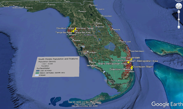
This modules lab required the creation of a google earth map depicting the hydrography, population density dot map, and a tour of major metropolitan areas created in google earth and delivered as a .kmz file.

The map above was largely created in google earth by adding provided .kmz files for counties and dot densities to a my place folder created for this project. The picture overlay tool was used to add the provided legend. The hydrography layer was given as a shapefile and the symbology needed to be adjusted to match the provided legend using ArcGIS Pro. Once the symbology was set the layer was exported as a .kmz using the Layer to KML geoprocessing tool. Once everything was added to google earth the placemarks (yellow pushpins) were added to the required points of interests and the tour and a recording was started while I manually selected the placemarks, toggling the dot density layer and manually panning around the points of interest were done as needed.
Comments

Popular posts from this blog

GIS Programming Module 4

  The below images are the output of the script for module 4 followed by the flowchart for the script. This module covered manipulating and editing data in feature class attribute tables. What you see below is the result of creating a new geodatabase, copying all shapefiles saved to the module 4 data folder to the new geodatabase, a search cursor identify the name, feature, and population of all New Mexico county seat cities populations. Finally it prints out a dictionary that has been populated with the county seat names and populations. Output: Flowchart:

GIS 6005 - Module 6

  Because the data provided for the above map contained positive and negative values which ArcMap does not support for proportional symbols, the data had to be modified. All states with positive values were exported to a new shapefile and the same was done with states with negative values. This was all that needed done with the positive valued states. However, for the negative valued states a new field needed added to the attribute table and it had to be populated with the absolute value of number of jobs lost to convert them to positive integers.  To prepare the data for bivariate visualization classes needed to be made. To do this, three class quantification was applied to each desired variable to divide each into three relatively equal groups. Then all values in the first group of the first variable were classified with an 'A', then the second group was given a 'B', and the third was given a 'C'. the same thing was done with the second variable however 1, 2 ,...

GIS 6005 - Module 1

  General: General features were given large black font with a small white halo to increase legibility and visual contrast. The font size is the largest of any font on the relevant feature. The text was placed in a central location without overlapping other labeled features or important data. Water Features: Water features were given dark blue italic serif font. The color chosen was dark enough to allow legibility and contrast with the light blue water background.   For the Golden Gate and San Francisco Bay labels they are placed in a central location within the water feature at a level angle with the page. The Lake Merced label was angled to line up and be contained within the lake. Park Names: Park labels were given a dark green color with a thin white halo to allow visibility and contrast while still keeping the labels intuitive. Font size was chosen to keep the labels within the boundaries of the park. However, due to the shape of Lincoln Park the label overhangs how...