M4 Lab: Data Classification


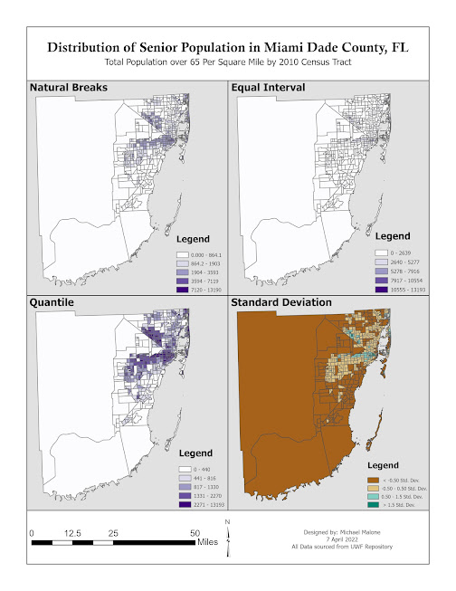
This weeks module was about the different methods of data classification. The lab was designed to take these methods and apply them to a choropleth map, or more specifically two presentations of four maps each. Each presentation containing one map of Natural Breaks, Equal Breaks, Quantile, and the Standard Deviation classification methods. The above maps display these methods by analyzing the senior citizen distribution in Miami Dade County, FL. The top map was created in ArcGIS Pro first, it displays the percentage of senior citizens in each census tract and shows how the data is displayed differently using each of the classification methods. The bottom map was created by saving a copy of the top map and changing each frame to show the total population of senior citizens per square mile. Once these were finished we were tasks with determining what each method hides or reveals and which presentation was most accurate. I believe the total population per square mile is the least misleading and should be used since the percentage doesn't take the total population of each tract into account. This means that a tract could have a higher percentage of senior citizens but a smaller total number of seniors and still show up as darker on the map. I believe the standard deviation method is the most reliable since classes don't get watered down and are purely displayed by how far from the average each tract is.


Comments

Popular posts from this blog

Module 5 - Unsupervised and Supervised Image Classification

  This weeks module focused on classifying images using multispectral signatures. Above you can see the completed classified land cover of Germantown, Maryland. To create this image above signatures were collected that correlated to each required feature. Then bands were chosen (R:4 G:6 B:5) that contained the largest separation amongst features to minimize spectral confusion. In the above image roads and urban areas were often confused leading to a much larger area of roads than actually exist. The inset map contains a classification distance map which displays the distance each cell is (spectrally) from the sample points with brighter pixels being further than darker pixels. This indicates that brighter areas have a higher chance of error.

Lab 5: M 2.2 Interpolation

  This weeks module focused on identifying the best interpolation method for modeling the air quality over Tampa Bay. Four methods were tested using the same set of sample points Thiessen, Inverse Weighted Distance (IDW), Tensioned Spline (seen above), Regularized Spline. Thiessen Interpolation assigns all cells in the raster with the value of the nearest sample point. IDW calculates the value of all cells by considered multiple sample points nearby and giving closer points a higher weight than further points. Both Spline methods create a smooth surface over the sample points but the regularized version creates a smooth curvature regardless of the range of values in the sample meaning cell values can end up both above and below the minimum and maximum values found in the sample. The tension model attempts to fix this by constricted the curvature of values to the ranges found in the sample points.

GIS 6005 - Module 4

  Above is a choropleth map of the population change percentage in North Dakota counties between 2010 and 2014. The colors were chosen to intuitively indicate bad (red) for population decline and good (blue) for a population increase. The legend patches were snapped together to give them an appearance of continuous color that mimic the continuous data in the dataset.